UI/UX CASE STUDY
A symptom tracker and database tailored towards patients adjusting to new psychiatric medications
A symptom tracker and database tailored towards patients adjusting to new psychiatric medications
Trying new psychiatric medications is often tedious. Patients must track their progress over several months since they require time to start working. In many cases patients need to try several medications before finding one that works well. Stigmatization has also led to a lot of misinformation about the usage of psychiatric medications, and many patients feel anxious about trying them.
Create an app that will allow patients to track their mood and side effects while trying new medications. Provide reliable access to key information about their medications such as drug interactions, common side effects, and dangerous symptoms to look out for.

Age: 23
Education: High School Degree
Hometown: Tampa
Family: Lives with her mom and 2 sisters
Occupation: Server
Kiara was diagnosed with Generalized Anxiety Disorder and has been recommended to a psychiatrist by her counselor. She is uncomfortable taking new medications and wants to research her options.
“I’m nervous about trying a new medication, but I don’t want to bring it up to my family and worry them or feel judged.”
Provide trustworthy resources to help her feel informed on what side effects she could expect
System to keep track of symptoms to easily report back to her psychiatrist. In case of emergency, have available contacts to help
A quick overview to help her know what is important to report to her psychiatrist
Based on user interviews, the patients’ primary concerns were about tracking their side effects and understanding the severity of their side effects. Having a built in database to easily reference this information in one place would help streamline the process and filter out potential misinformation.
The first round of wireframes were tested in a 15-30 minute moderated usability study with 5 users who had experienced taking psychiatric medications. The key findings were:
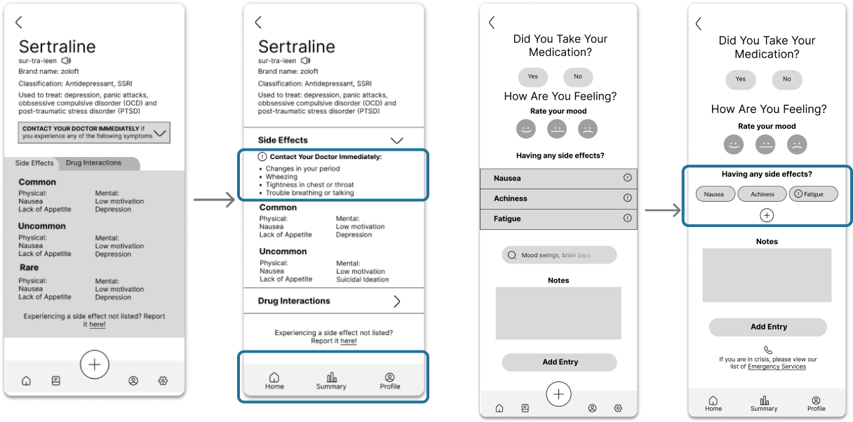
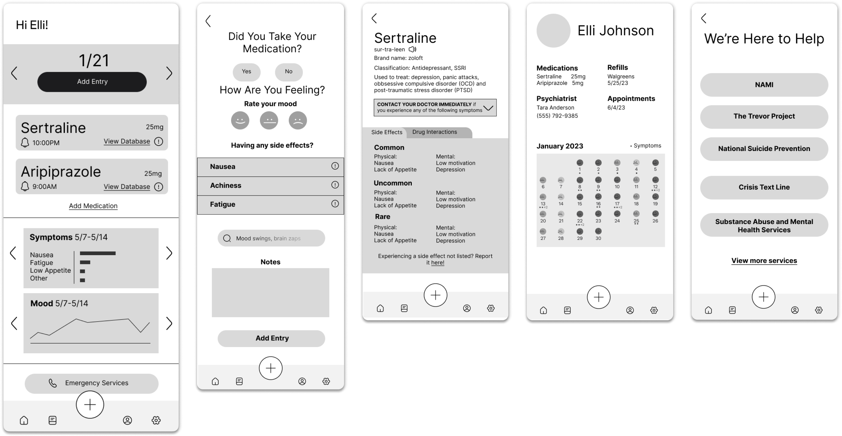
Navigational icons were not universally understood by all users, particularly the book icon intended to lead to past entries.
Search bar was not understood as a method to add newly experienced side effects.
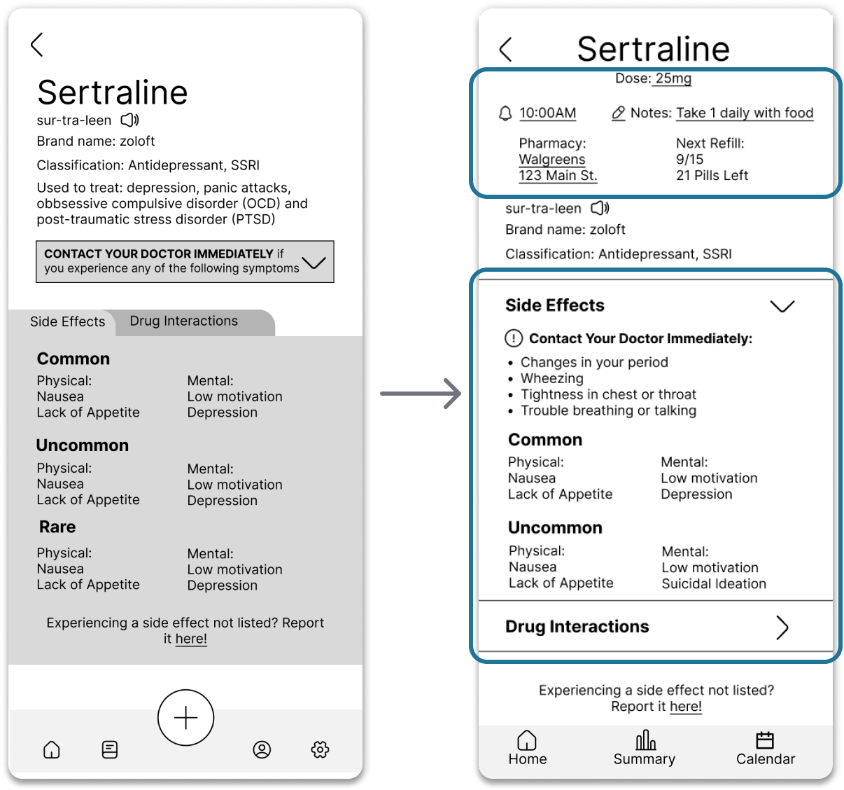
Users assumed their information such as dose, notifications, and medication instructions would be on the same page as the side effects.
Placement of the severe side effect warnings made it seem like all listed side effects were severe.
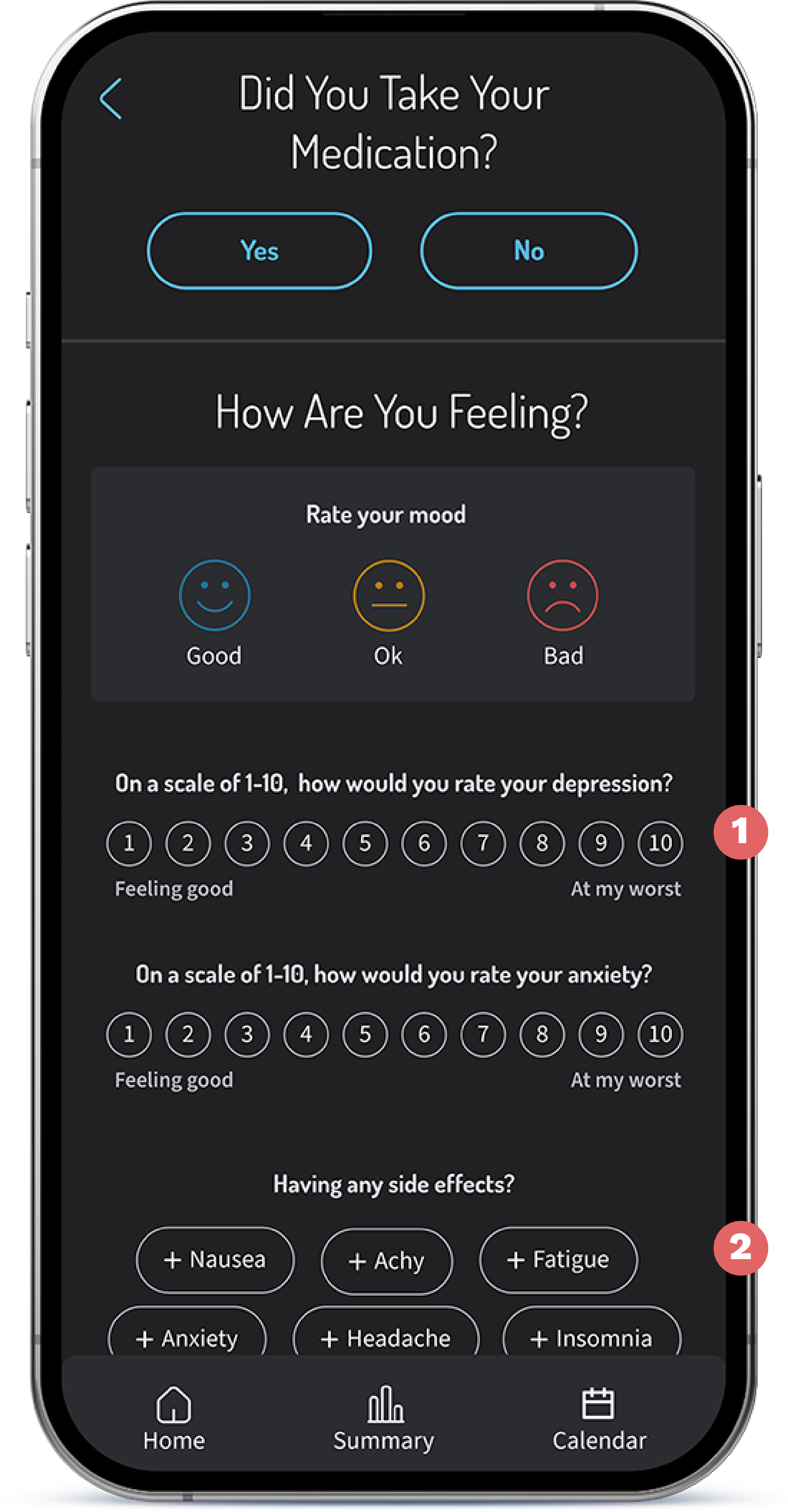
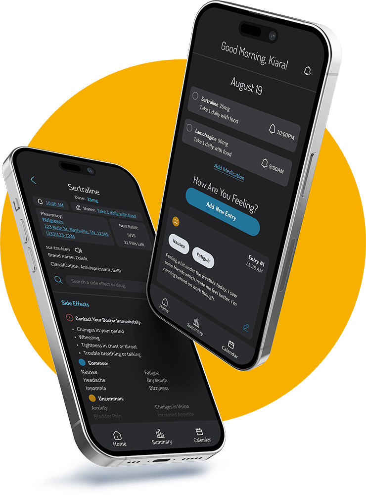
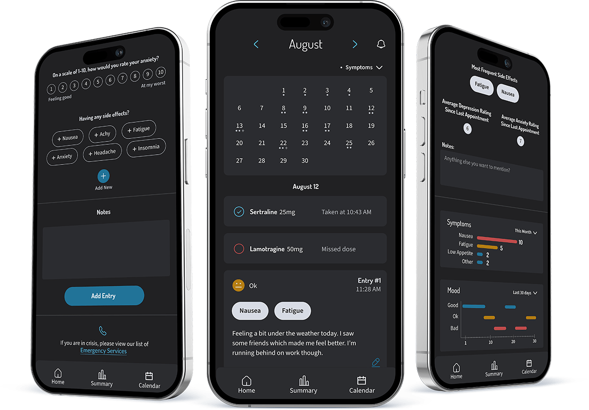
Gather consistent data on how the patient is feeling, as well as if they took their medication that day.
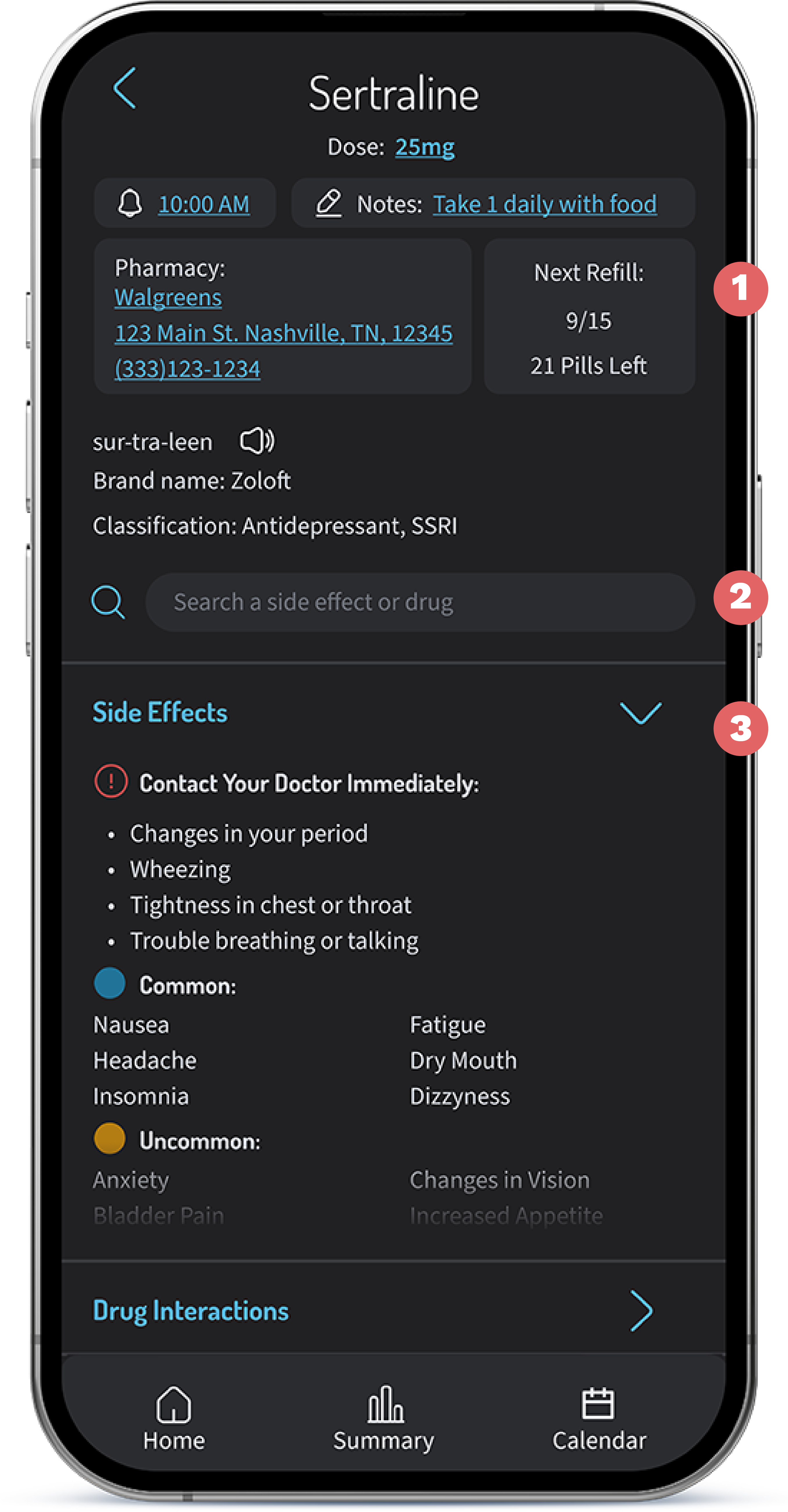
Easy to digest info about the patients personal details and an overview of the side effects and drug interactions of the medication.
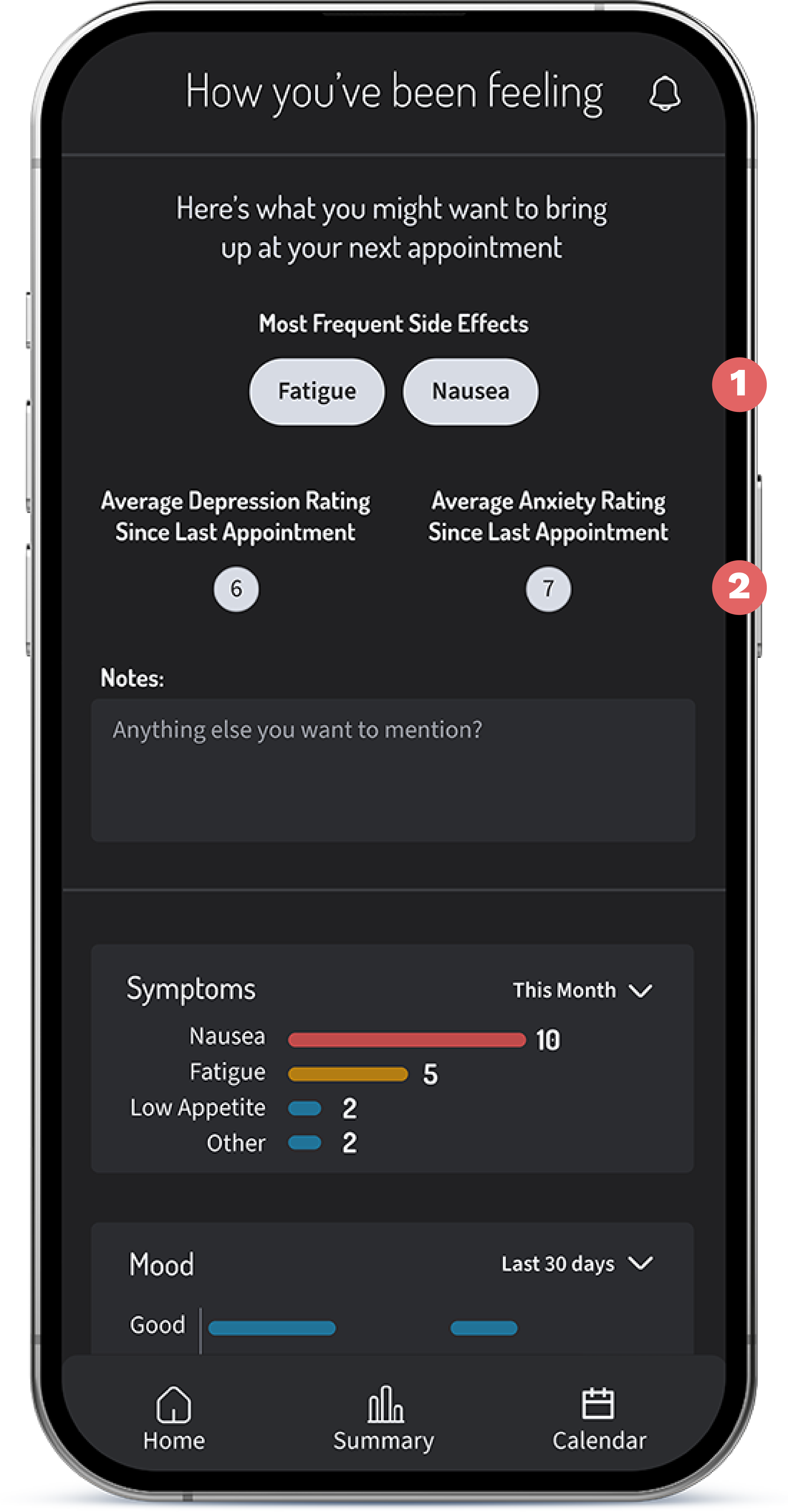
Helps the patient be prepared and know what to bring up at the next appointment.
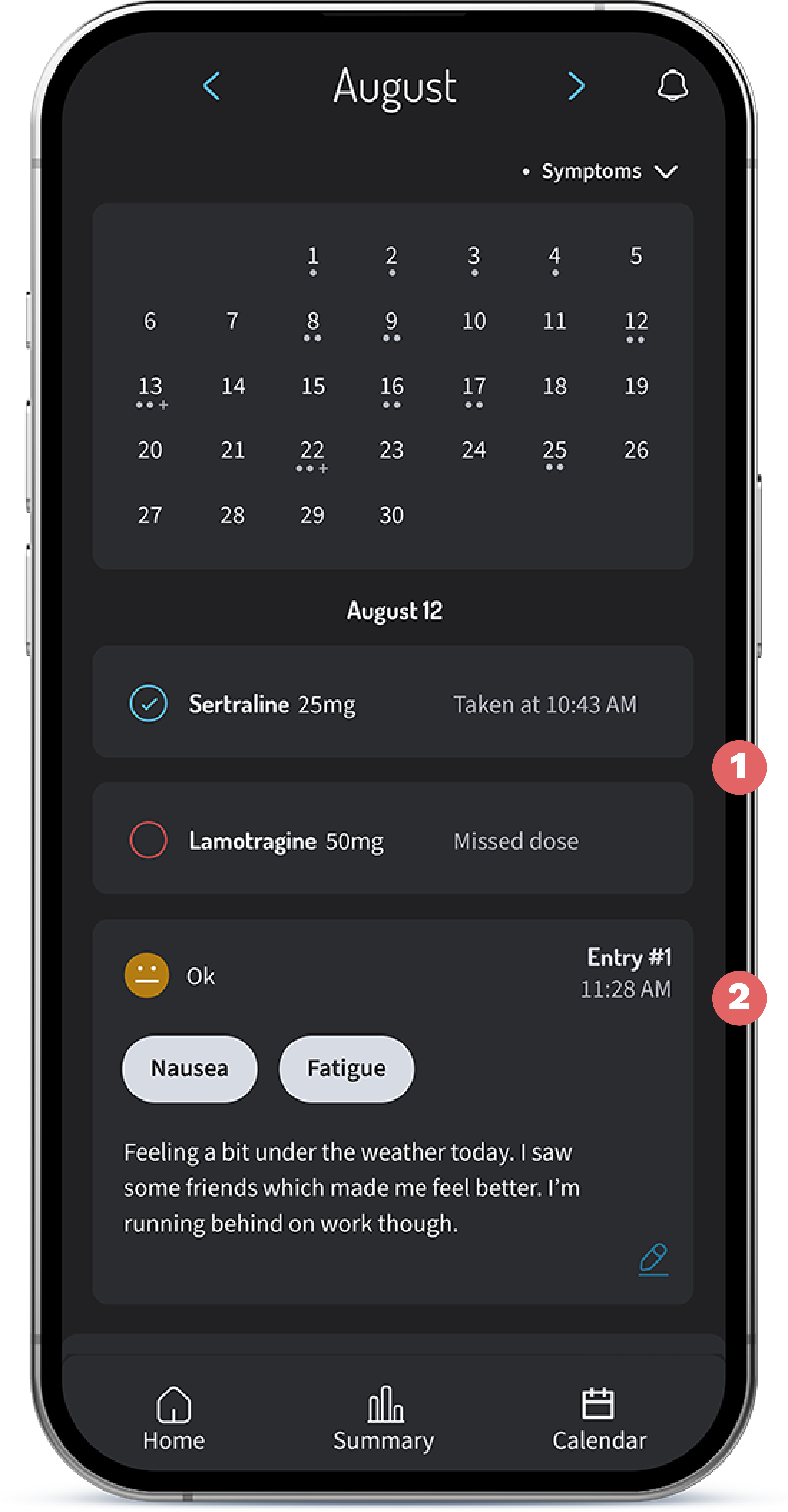
View previous entries, medication history, and scheduled appointments
While many medication tracker apps exist, psychiatric medications have a unique process that requires
a long trial process. It’s important for patients to monitor their symptoms over time in order to
accurately describe to their doctor how they are feeling.
In a culture that holds many negative or even false perceptions of psychiatric medication, I
believe having better resources tailored specifically to these patients will benefit them greatly.