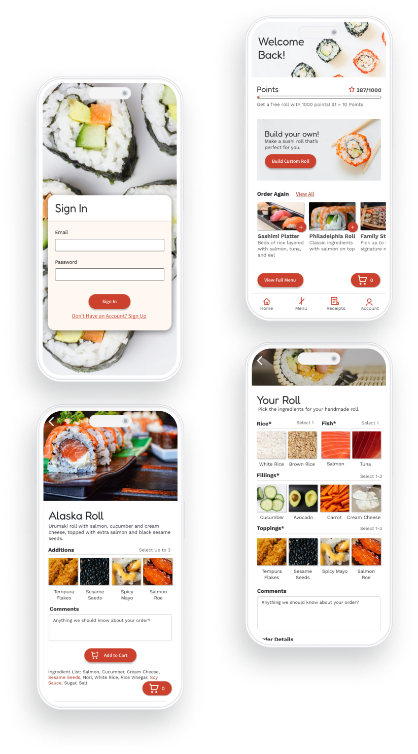
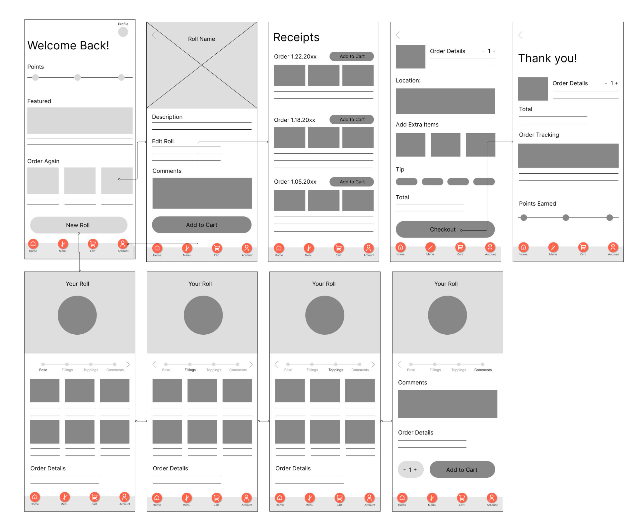
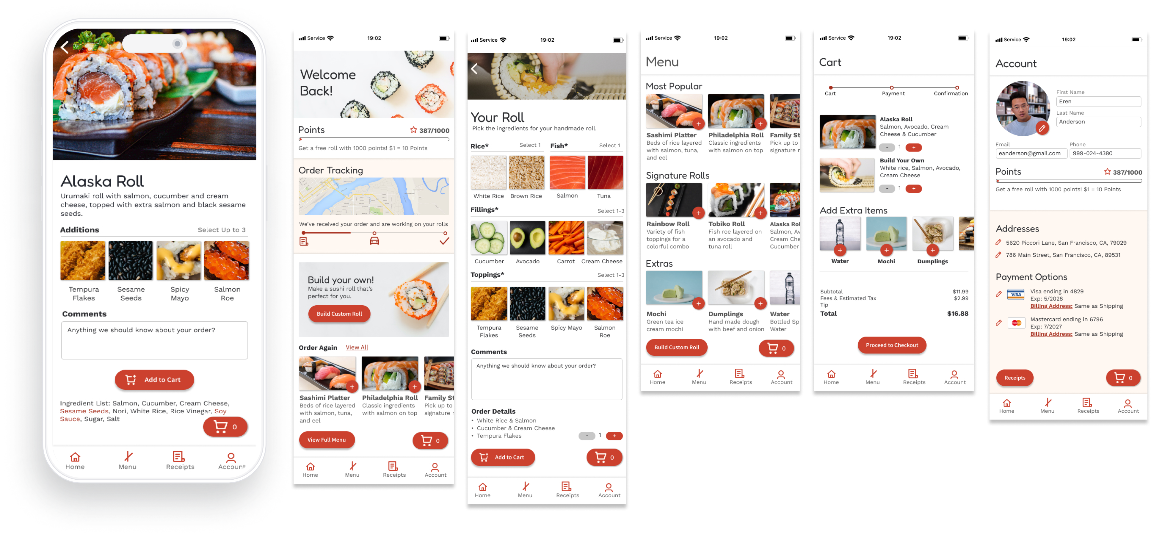
A Build-You-Own Sushi Delivery App

The concept for this project involved combining consumer needs for both food delivery apps, and build your own meal options. This concept app was created for the Google UX Design Certification.

User Interviews

5 users who fit the target audience criteria were interviewed to better understand their experiences and pain points with online food ordering services.


Interview Questions:

  • What motivates you to use food takeout apps?
  • Are there common experiences that frustrate you when ordering online?
  • Are there situations that prevent you from using online ordering?
  • Are there specific features that drive you to use one delivery app over another?


Target Audience

  • Sushi enjoyers
  • Frequent takeout buyers (at least a few times a month)
  • People who are familiar with build your own meal options
  • Busy people living in urban or populated locations
  • Age 18-60
Sushi delivery app.

Pain Points

Lack of Images
5 out of 5 participants expressed needing to see images of the food before ordering.

Time Efficiency
5 out of 5 users used takeout apps to save time.

Reordering
4 out of 5 users said they need an easy way to reorder previous items and favorites.

Allergens & Dietary Restrictions
2 out of 5 users said they are often frustrated if an app doesn’t make ingredients clear for the sake of their allergies or dietary restrictions.

Competitive Audit

Doordash

  • Auto recommends previously ordered items at the top of the menu
  • Updates user on order progress and delivery ETA
  • -Rewards ads make the app feel cluttered and overwhelming
+

afjdkaljfdklajfkdjafkldajfkldjafkladjfkajfkldajfkjaflkdjaafjdkaljfdklajfkdjafkldajfkldjafkladjfkajfkldajfkjaflkdja;fdafjdkaljfdklajfkdjafkldajfkldjafkladjfkajfkldajfkjaflkdja

Concepts

Wireframes

In early concepts I used a multi page flow through the build your own roll experience to simulate the in person ordering experience. However after further research, this added too much time to the ordering process

Usability Study

These early wireframes were used to create a lo fidelity prototype to conduct a moderated usability study in which users were observed completing specific tasks and asked to narrate their thoughts and decisions.

Lack of Images

Although this prototype was lo-fi to test ideas before full implementation, all users expressed how important it was for them to see images to decide on the food.

Consolidate Pages

Having the build your own roll section split into multiple pages made it difficult for users to go back and edit previous order decisions, and felt time consuming to them.

Hard to Find Past Orders

Users hesitated when asked to find past orders, so it needed to be more obvious how to navigate to the receipts page.

The Final Result

Hi-Fidelity Prototype
Final app design.